The Project
For my advanced graphic design courses in college, I had been tasked with a couple intense midterm projects that overlapped into a one. I was tasked with creating a fictional restaurant and creating the logo, branding, menu, and website for it. This was the last website I hand-coded without the use of bootstrap or WordPress. It was a whole lot of blood, sweat, and tears and countless hours of work. The menu was actually printed and used for my Publication Design class. It felt so cool to have two projects becoming one big idea that I almost wished was my own real restaurant.
Concept Mockups
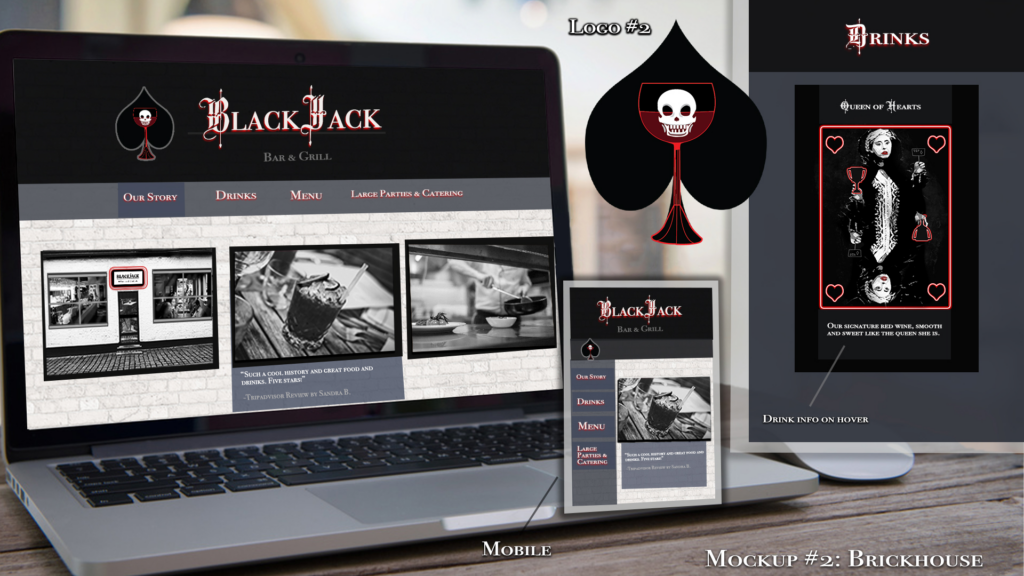
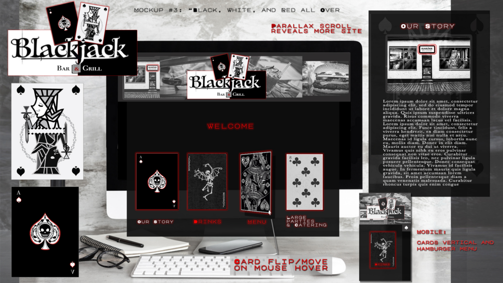
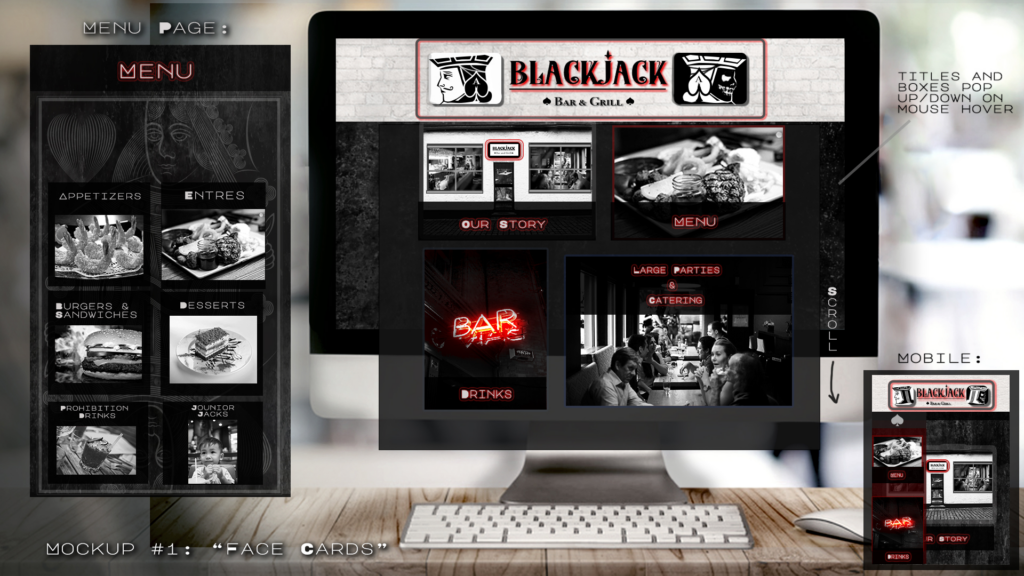
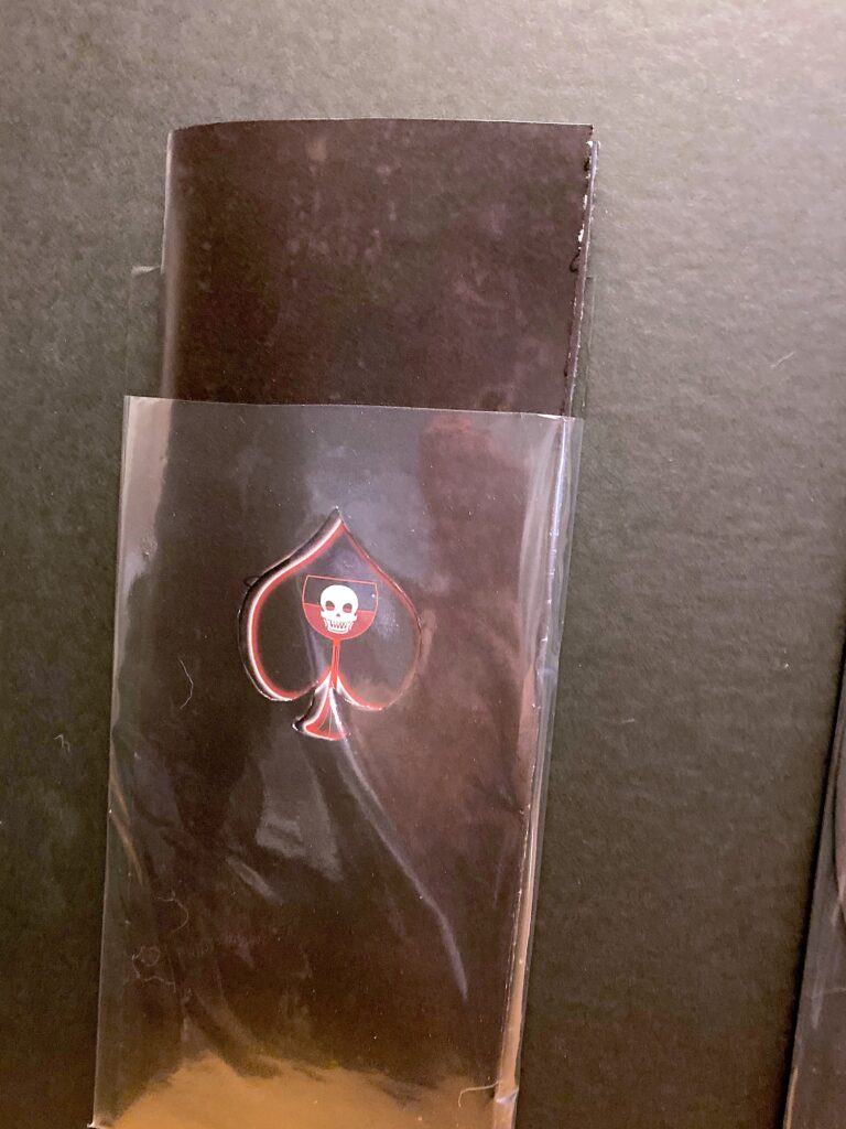
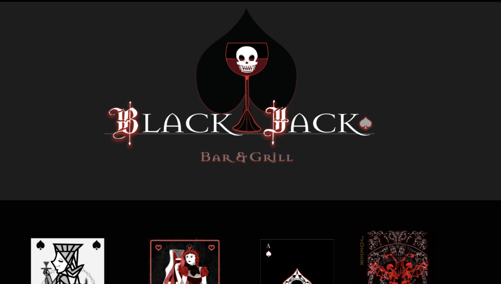
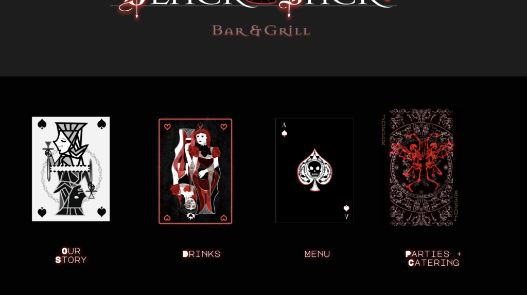
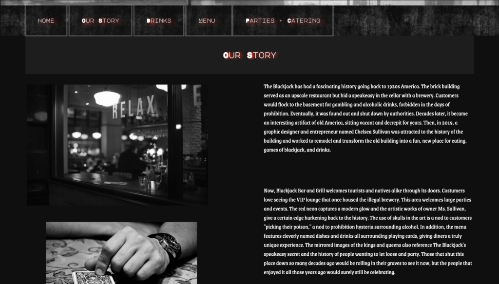
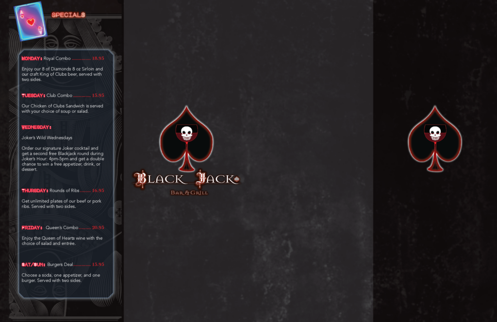
The idea for the restaurant was a place to go for something a bit classier than a dive but a bit more relaxed than a very stuffy, expensive restaurant. Blackjack was chosen as the theme to coincide with the twist on classical art, playing card art, and neon-lit statues that have become very popular in the Postmodern art era. I was able to incorporate this classic-yet-modern feel with the art and eventual chosen logo: the skull spade in the wine glass.
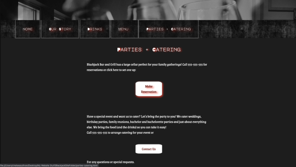
The big thing the restaurant would offer would be a chance for patrons 21 and older to win a drink or dessert if they win a round of blackjack at the table. It’s a very simple marketing concept that I honestly wished and hoped was a real thing after this project. I even spent time crafting a story that the restaurant was once a speakeasy in the 1920s and has been refurbished into a place dripping with alcohol, gambling, and a sassy-yet-classy atmosphere.
Artwork for the Project
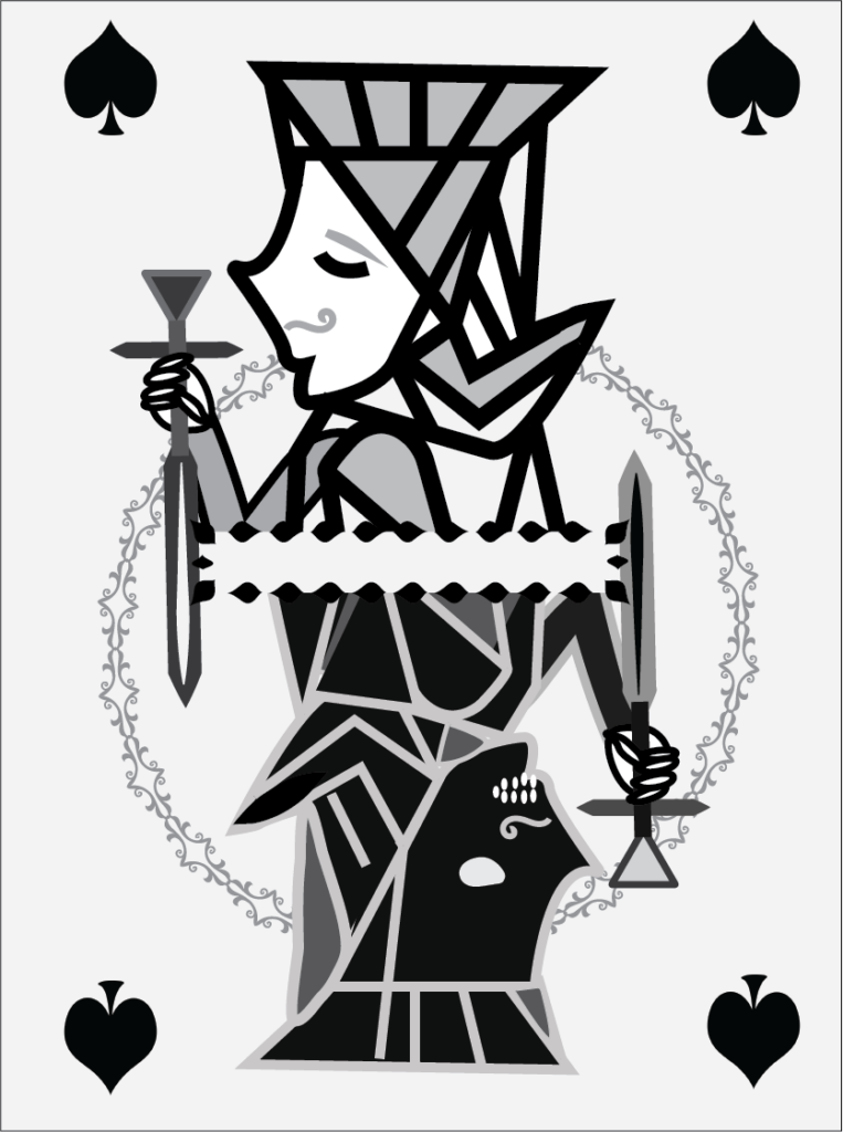
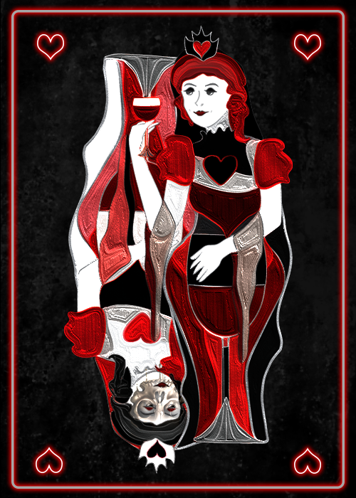
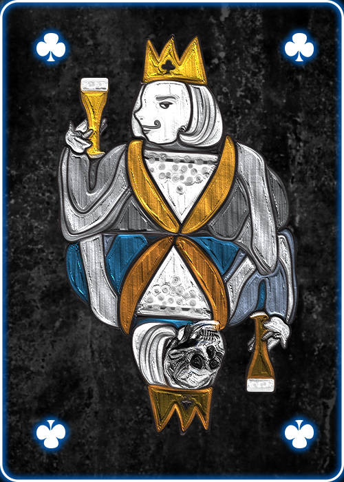
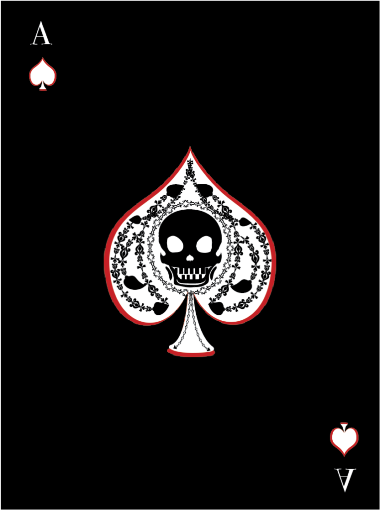
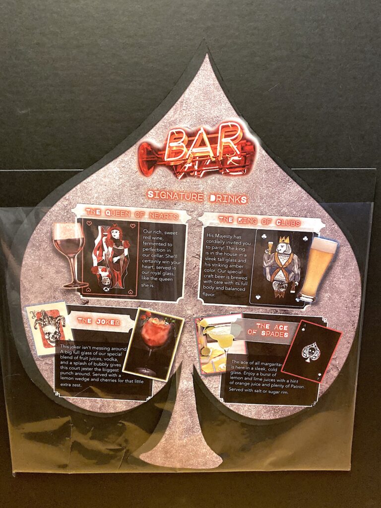
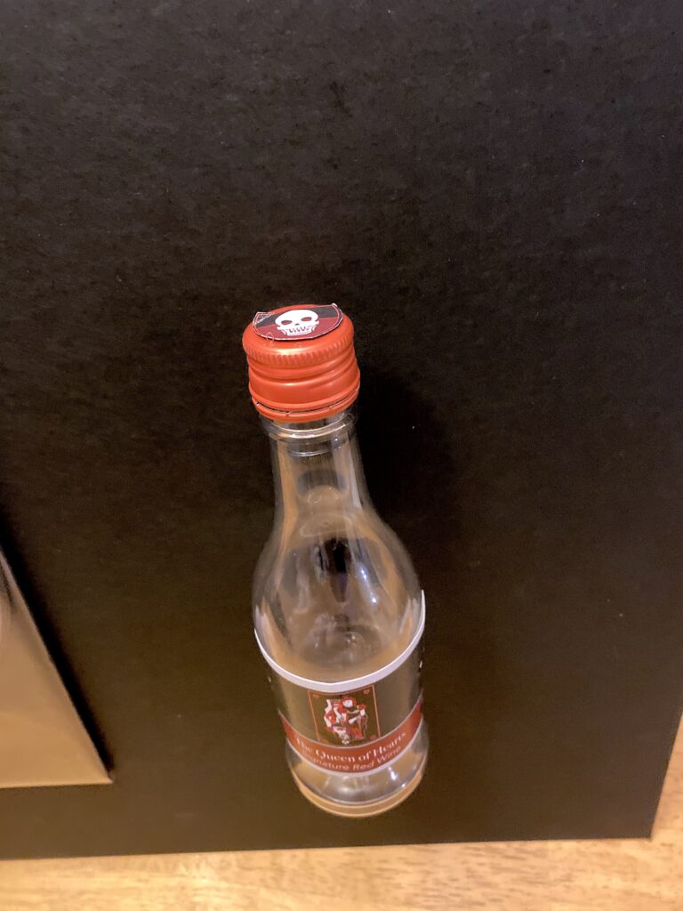
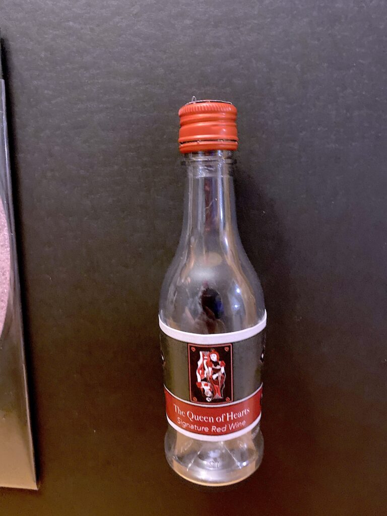
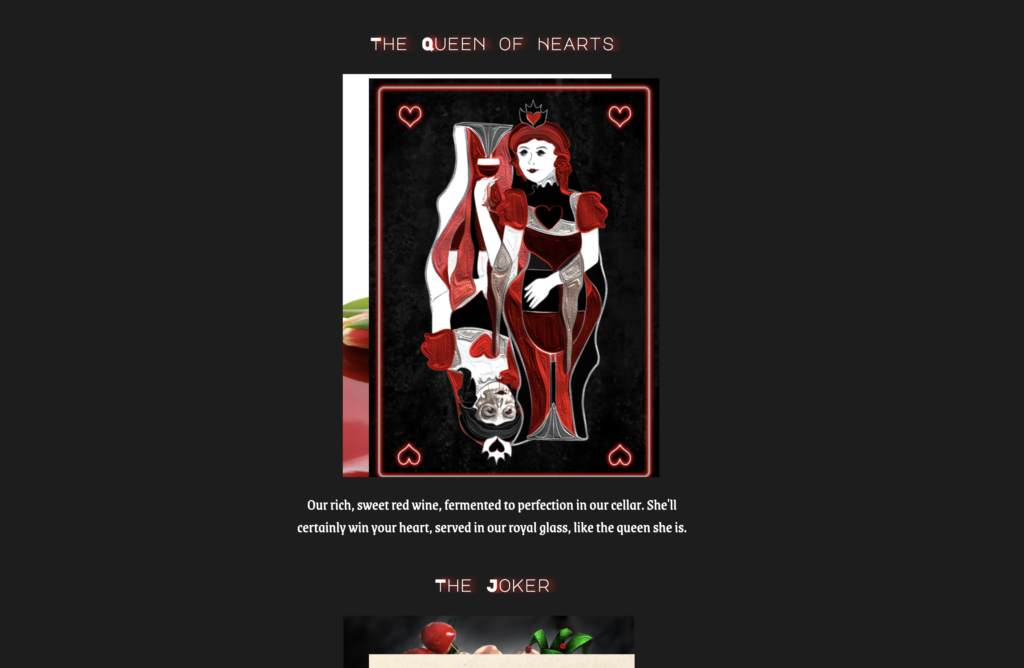
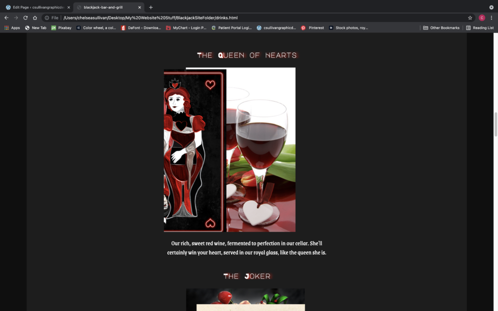
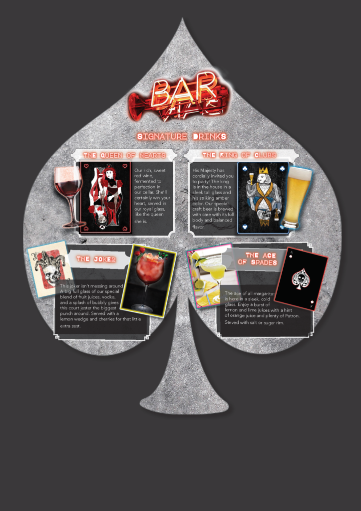
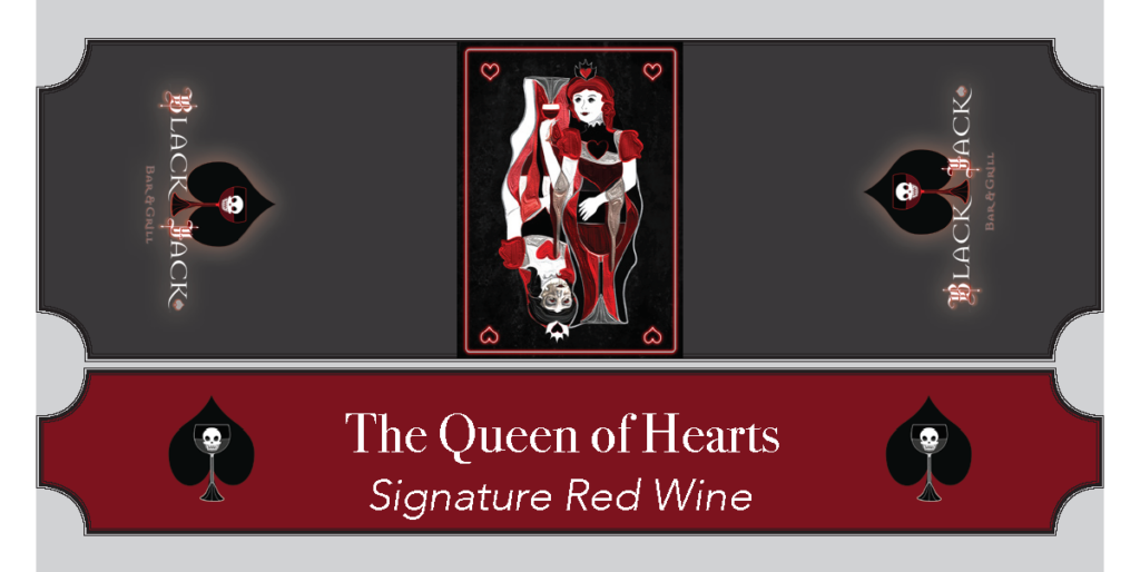
The playing cards were created as a way to market the drinks sold at the restaurant. The Queen of Hearts represents the signature red wine and the King of Clubs represents the craft beer. Other cards were created with the idea that the restaurant has their own set of cards to buy as well.
Finished Site Screenshots
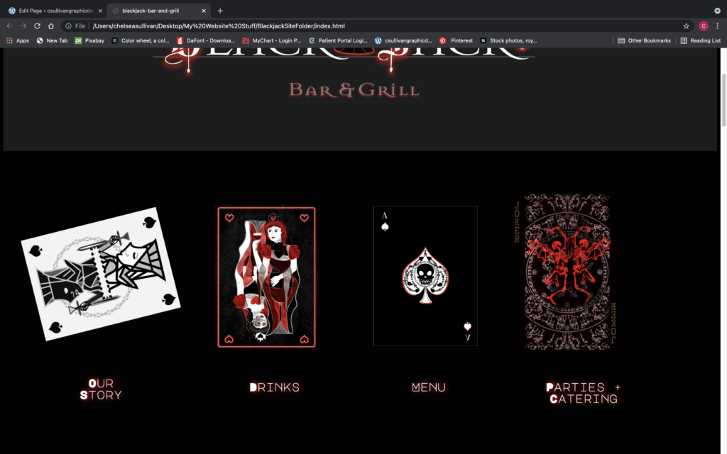
The finished site featured a ton of complex coding tricks I hadn’t even tried before. Having the cards flip around or slide around on the main page, and evening stacking/shuffling like real cards breathed so much life and character into my idea and kept me creatively fueled enough to act as though this was a real restaurant I was opening. Parallax effects, color changing effects, and so many CSS tricks made this site the most complicated I’d ever built by hand. This was even before I learned Bootstrap or WordPress, so it was surely a proud moment for me to look back on this and say I hand-crafted this baby on my own, one line of HTML at a time.
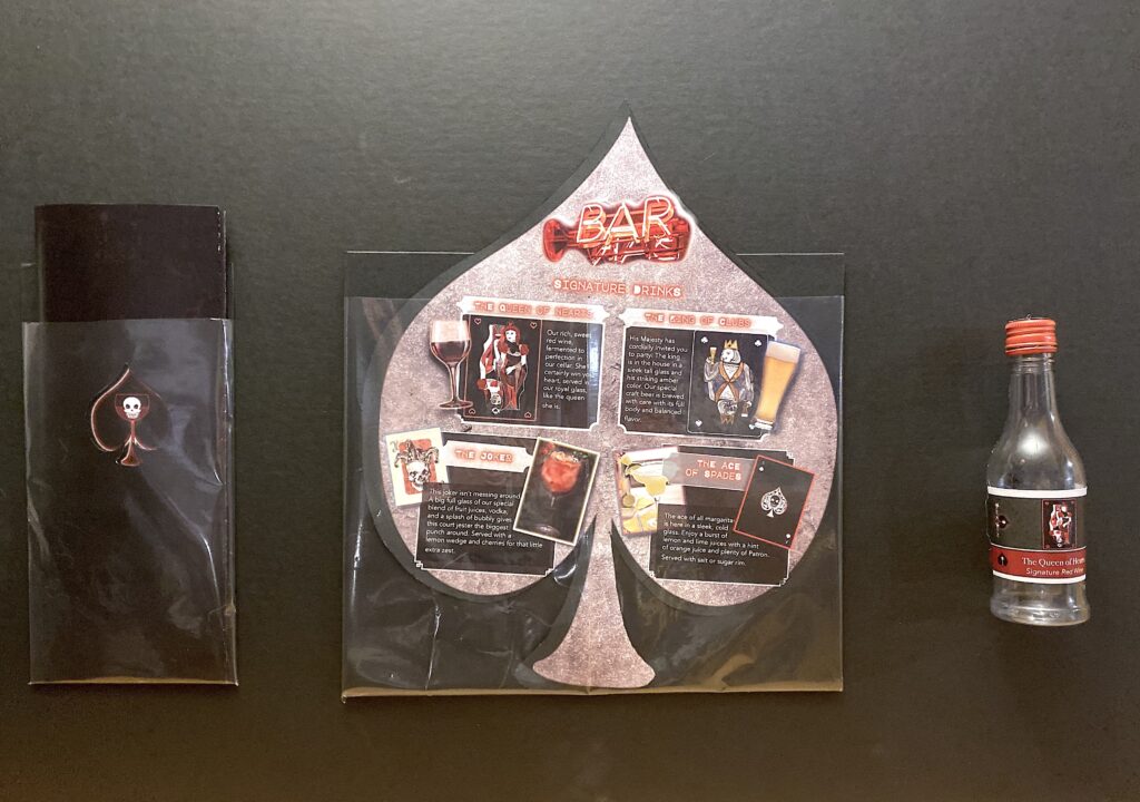
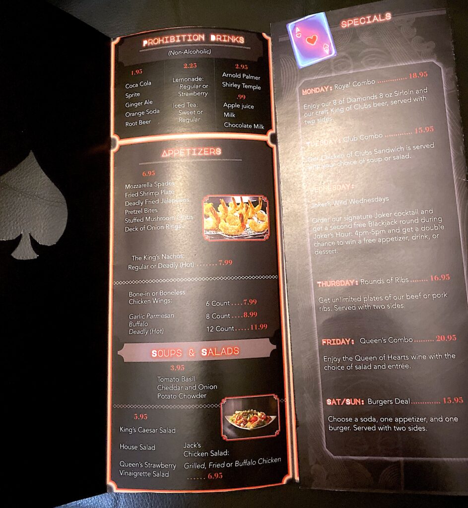
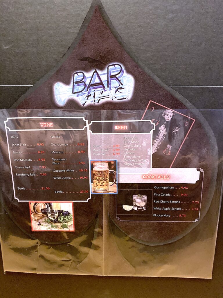
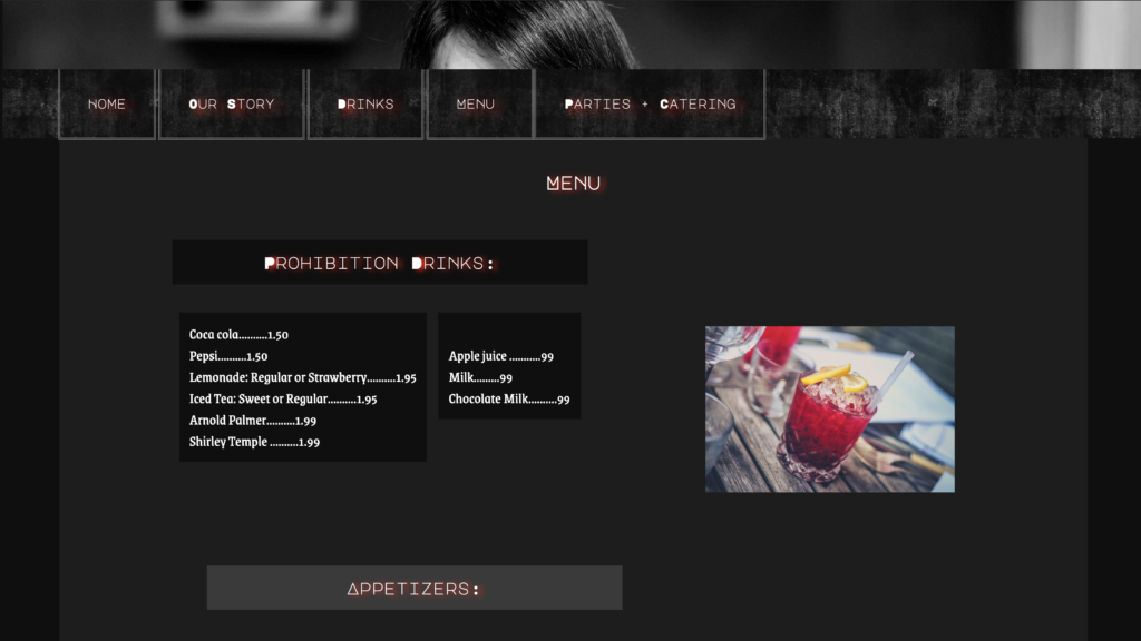
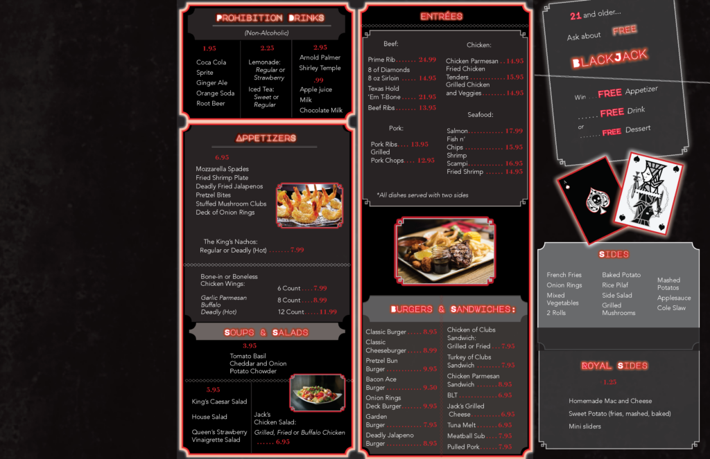
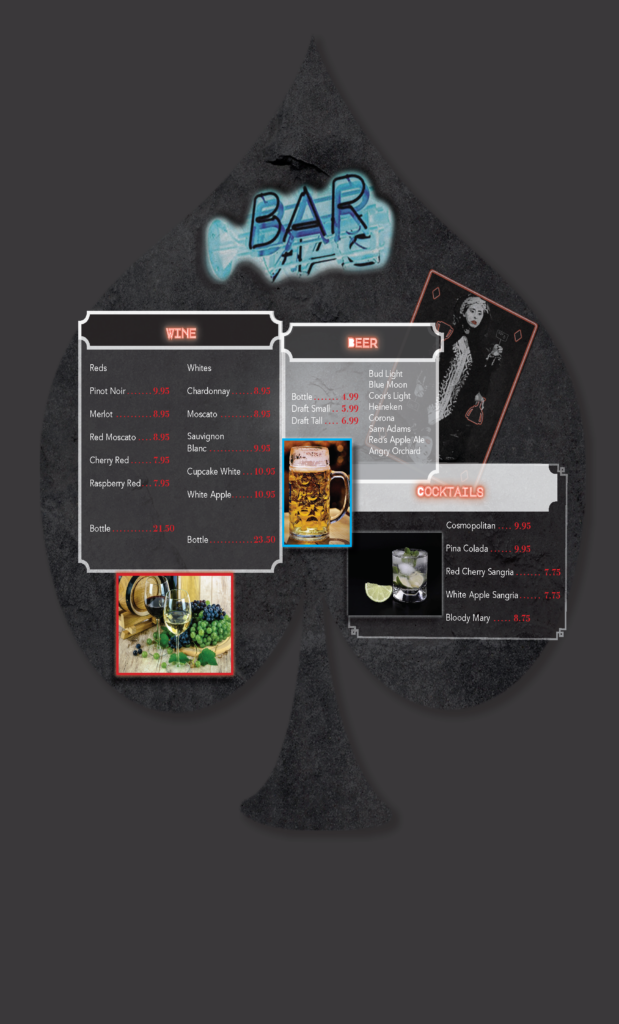
The Menu Project
This project that meshed perfectly with my web course, required me to create a restaurant and design the menu from front to back. I also had to create a secondary drink menu. The ideas all fell into place very nicely, but formulating the layout of the menu was a challenge. After much planning, I created a menu with multiple folds. The front fold featured a cut-out spade shape peeking beneath to the next fold that feature my Blackjack skull logo. From there, the customer could open the menu fully horizontally. The secondary menu featured a spade shape in keeping with the theme and some inverted colors. Both kept with the postmodern neon art style using the same fonts from the site, and I was able to continue feature the card artwork here as well.
Digital Menus
Printed Project