The Project: Depression PSA
In my first semester in college, I was new to the whole world of graphic design, but knew immediately it was something I wanted to do. I was excited to tackle my first ever big project: a PSA (Public Service Announcement.) These types of ads usually say something in few words that has a fact or statistic in it that resonates with the audience. We were given a wide variety of topics to choose from, but I chose a topic that was very close to home for me: depression. Dealing with chronic health problems, depression became a very big dark thing in my life. It affected my daily life in ways that was so hard to explain to others. It was hard for me to act like everything was okay, when inside, I was suffering in a very dark place all the time. I masked my symptoms very well, as a lot of people that struggle with depression do. I knew I had to put this into perspective in the ad. People often think of depression as just being sad all the time, when in reality, most people that have it try to hide it and suffer silently. I wanted my ad to be targeting the most common age group for depression: teens and young adults. I thought that creating something with flat design and brighter colors might get the point across in a simple and concise way.
Evolution of the Design
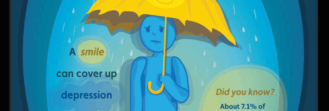
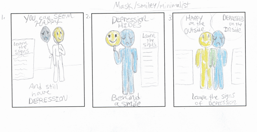
The thumbnail sketches below detail some of the design process in my class. I knew it would probably be a good idea to use color as a storytelling device. People often think of yellow as a happy color and blue as a sad color, so, my initial idea was to show a simply-designed, sad, blue person holding a smiling yellow mask or an object like this. I had been leaning quite heavily towards a mask, but this analogy had been done quite a lot already. It felt a bit too on the nose. Then, I had the idea of the person holding a yellow smiley face umbrella to shield themselves from the rain and depression, but it doesn’t stop it, as we see from their sad blue form under the umbrella. I went forward to create this design how I imagined it. On the right was the finished product. It was a very rudimentary design, with it being my very first graphic design project.
New and Improved Design
When revisiting my old projects, I knew I had to select this one to return to after I became advanced in Photoshop and Illustrator. I wanted to remake the PSA from scratch, but keep the same fundamental idea. I realized it could be a bit flat in design with also having a certain stylization. Flat design doesn’t been boring to look at by any means. Here, I was fully able to realize the idea’s potential, and breathe a great deal more life into the design than I had ever dreamed was possible when I made that first version. I think this new version helped to present the message a lot better as well, and I was so happy to create something that could talk about such an important issue in our world today.